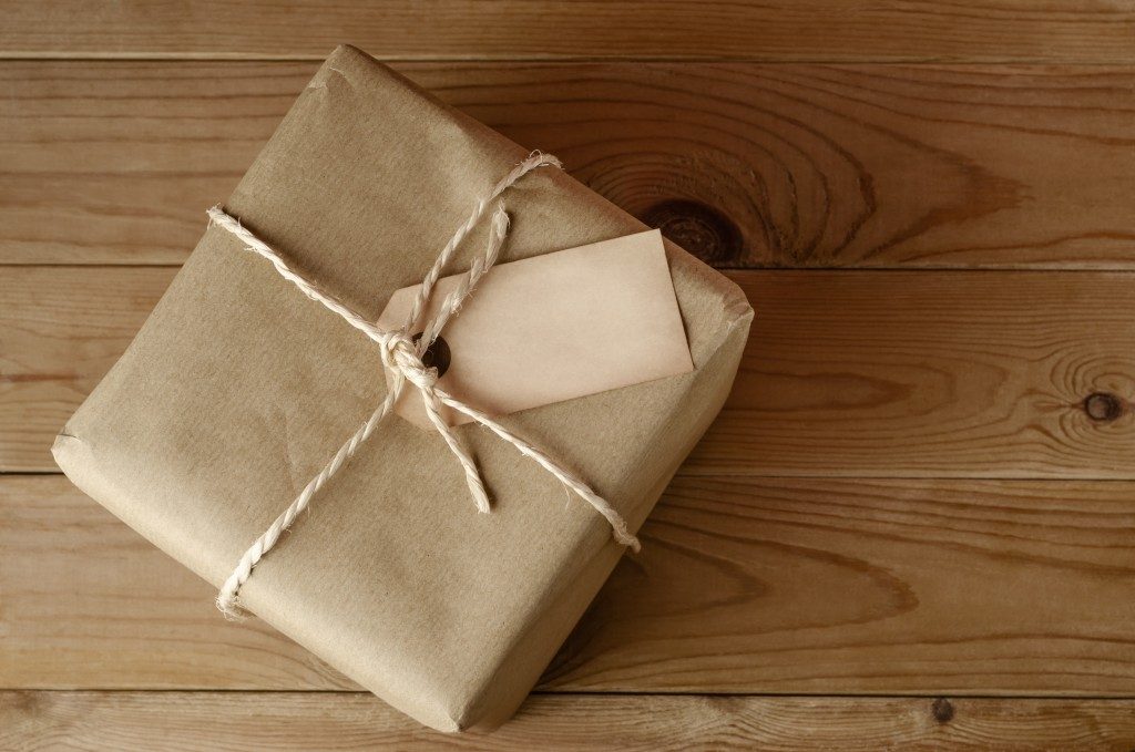
You have several material options for packaging your products. This is the primary element everyone will see, and so will either draw people to your products. An attractive and practical design for your package will be the key to increasing sales and engage customers. The key elements you should focus on include colour, style, font size, and the product’s design.
These packaging materials will allow you to showcase your creativity and your product. You should look for design and printing services in Singapore that use a multitude of materials, such as paper, plastic, and even organic materials such as wood or natural plant fibres. The designer could use these materials to accentuate certain qualities in your product, such as environmentally-friendly, reusable, or even recyclable. Make sure that you ask the designers to choose materials that suit the qualities of your product. There are virtually endless design styles you can choose for your product packaging. Here are a few influential ones in today’s industries.
Minimalist Design
This style favours simple forms in which nothing else can be removed without affecting a package’s functionality. While it is a smart way to cut your production costs, you should not assume that a minimalist style means a blank package. The package should feature your brand colours, various crucial messaging on your product’s safety and ingredients, and an attractive shape to make up for the minimal design.
Vintage Aesthetic Design
This style option features old-fashioned labels, dark colours, and handwritten fonts. It evokes nostalgia and will invoke an immediate impression of craftsmanship and tradition in your product that makes you seem like a seasoned manufacturer. The vintage aesthetic package style is generally used in beverages, food products, and cosmetic products. It can, however, be used on any product aiming to generate nostalgia in their market.
Pattern-Based Designs

Patterns use repeated graphics, shapes, or abstract images on your package. The pattern you choose could serve as an iconographic symbol of your product or simple, repeated elements. Pattern-based designs are relatively easy to put together and make your packaging appear simple and sophisticated at the same time.
Culture or Tradition-Inspired Design
One of the least explored yet very profitable areas of product design is the one that draws inspiration from the local culture. Most companies use their local culture and colour to sell to the local audience but also their international clients. They sometimes cite distinct customs, intricate artwork, and lively colours that would suit your package design.
Luxury and Opulence
This approach mixes several styles and heavily relies on black. This is based on the association of black with a premium experience, opulence, and elegance. Companies that use luxurious product packaging features special finishes like embossing, gold and silver touches, hot stamping, and UV varnishing.
Most manufacturers pay considerable attention to their product’s creation to guarantee it appeals to their target market and does not break any local guidelines and laws. These product designs should not be an afterthought in your production’s design process. It can affect how people can perceive your product and even its reception in the market.